Heatmaps: How to Track User Behavior and Optimize Your Product
A heatmap visualizes where users click, scroll, and hover on your product. Learn heatmap types, real examples, and how to act on data. Start optimizing now!


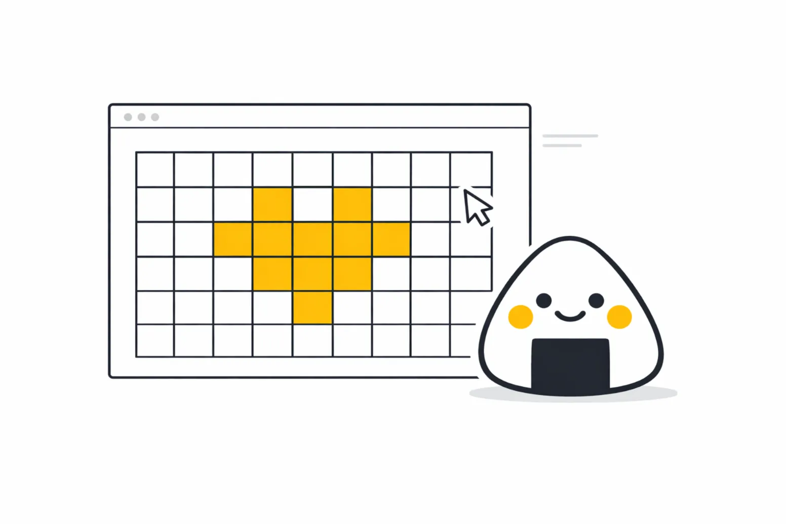
Table of Contents
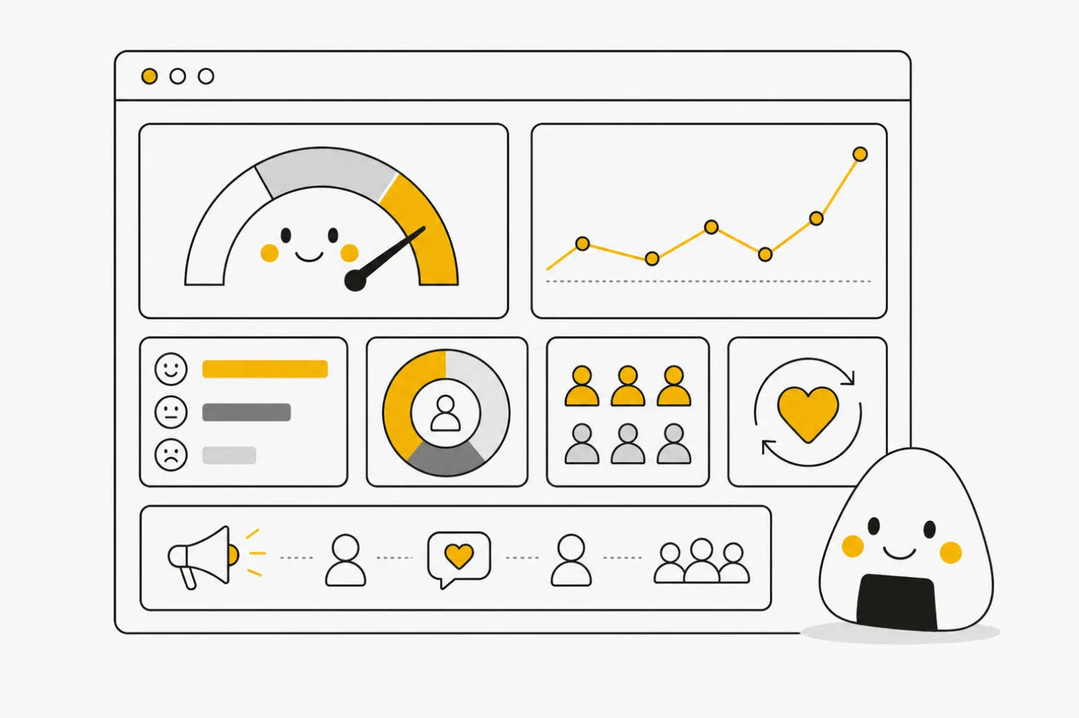
A heatmap is a powerful data visualization tool that uses color to represent the intensity or frequency of user interactions on a digital interface. Instead of staring at endless rows of raw numbers in a spreadsheet, product teams can instantly see exactly where their users are clicking, scrolling, and hovering. This visual approach completely transforms how you evaluate your product's usability and overall market fit.
As a product professional, your primary goal is to remove friction from the user journey. Relying on intuition or vocal customer complaints only gives you a fraction of the story. The vast majority of your users will silently struggle with confusing navigation and quietly abandon your application without ever submitting a support ticket.
In this article, we will explore the critical mechanics of tracking user behavior through color-coded analytics. We will cover the core methodologies for capturing accurate data, the science behind visual perception, and how you can translate these colorful charts into concrete roadmap decisions. By understanding these concepts, you can stop guessing what your users want and start building interfaces that naturally guide them to success.
Providing a Clear Heatmap Description
To build a highly effective product, you must start with a concrete heatmap description and understand the different operational layers involved. A visual report is not just a single, monolithic tracking tool; it is a collection of specific behavioral tracking methods. The industry standard methodology, popularized by platforms like Contentsquare and Hotjar, categorizes these visualizations into three primary types: Click, Scroll, and Move. Click tracking shows exactly where users tap on a screen, revealing if they are trying to interact with non-clickable elements. Scroll tracking indicates how far down a page users travel before abandoning it, which is vital for positioning your most important calls-to-action. Move tracking follows the mouse cursor, giving you a strong proxy for where the user is looking and hesitating on a desktop device.
However, product managers must be incredibly careful not to confuse where a mouse moves with where the human eye is actually focusing. Foundational usability research by the Nielsen Norman Group on the F-Shaped Pattern of reading on the web proves that users do not read digital interfaces linearly. They scan them in a heavy, top-left predictive pattern. When you overlay this eye-tracking reality with your click data, you gain a massive strategic advantage. You realize that your interfaces must be designed for rapid scanning from day one, rather than just diagnosing usability issues after the product has launched.
Furthermore, you must aggressively segment your data by device type and user state. Analyzing a blended report of desktop and mobile traffic will completely muddy your insights, as a desktop hover interaction simply does not exist on a mobile touchscreen interface. The "average user" does not exist in product management; if you do not segment logged-in power users from first-time mobile visitors, your data will inevitably create false positives.
Real-World Heat Map Examples in Action
Examining practical heat map examples is the absolute best way to understand how these tools bridge the gap between raw data and strategic product decisions. At Product People, we rely heavily on these visual insights when we are tasked with scaling complex digital experiences across new, diverse user bases. We use our first-hand experience to cut through internal assumptions and let actual user behavior dictate the roadmap. A prime example of this occurred when we partnered with a major financial institution to launch an entirely new digital investment platform.
Our core challenge was ensuring the interface felt intuitive across multiple distinct geographic regions with varying levels of financial literacy. Tracking visual behavior was a foundational part of the research that helped us successfully launch the Investments product for the bank across ten different European markets, while fully preparing the technical architecture for future expansion into Sweden. During the initial beta phase, we deployed scroll and click tracking on the primary portfolio dashboard. The internal executive team was convinced users would want to scroll deep into the page to read highly detailed historical market analyses. However, our visual reports proved the exact opposite.
The data revealed a massive "cold zone" just below the initial fold; over eighty percent of users never scrolled past the top summary metrics. Instead of forcing the users to adapt to our assumptions, we completely restructured the dashboard, moving the core execution buttons to the very top right of the screen. By seamlessly linking our product analytics and user feedback to product improvements, we dramatically increased overall trade execution rates. When you apply these methods to your own product, look for areas where user clicks are heavily concentrated on unlinked text or flat images. These "rage clicks" are immediate indicators of severe user frustration and represent the fastest way to improve your overall user experience.
Perfecting Heat Mapping Graphic Design and Data
Mastering heat map data visualization is not just about installing a tracking script on your website; it is heavily dependent on understanding the nuances of human visual perception. When you present these reports to your executive stakeholders, the colors you choose directly influence how they interpret the severity of the data. Unfortunately, the default setting in many analytics tools relies on a deeply flawed heat mapping graphic design strategy: the classic rainbow color scale. While a spectrum spanning from red to blue through yellow and green might look impressive in a slide deck, it is actually scientifically detrimental to accurate data analysis.
Advanced research published by IEEE Computer Graphics and Applications proves that the rainbow color map is considered harmful because the human brain does not inherently order those distinct hues by magnitude. A stakeholder might falsely interpret a bright yellow spot as vastly more important than a dark green spot simply because yellow is a brighter, more striking color, completely misinterpreting the underlying numerical density. This creates a dangerous perceptual bias that can wildly distort your product prioritization discussions and misallocate engineering resources.
To avoid this fatal analytical error, product managers and designers should always configure their visual reports to use a sequential, single-hue color scale. For example, using a scale that simply transitions from a very light blue to a very dark blue ensures that the human eye correctly and instinctively interprets darker shades as higher density or frequency. By applying the rigorous science of human visual perception to your daily analytics, you ensure that your team makes product decisions based on factual user behavior rather than confusing optical illusions.
FAQs
In Conclusion
Integrating visual behavior tracking into your regular product discovery process completely removes the guesswork from user experience design. When you can literally see where your users are struggling, prioritizing your engineering backlog becomes an objective, data-driven exercise rather than a political debate.
As you review your core funnels this week, challenge your team to look beyond simple conversion rates. By visualizing the actual human behavior driving those numbers, you unlock the precise insights necessary to build truly frictionless, world-class software.

Interested in working with us?
Our Interim/Fractional Product Managers, Owners, and Leaders quickly fill gaps, scale your team, or lead key initiatives during transitions. We onboard swiftly, align teams, and deliver results.
Read More Posts
July 13, 2026
Net Advocacy Score: What It Is and How to Measure It
Net advocacy score measures customer loyalty and word-of-mouth. See how it compares to NPS, which tools to use, and what benchmarks mean.
July 10, 2026
Attrition Rate: Definition, Formula, and How to Reduce It
Learn what attrition rate means, how to calculate it, and proven strategies to reduce customer attrition for SaaS and subscription businesses.

July 8, 2026
Product Backlog Refinement: What It Is and How to Run It
Learn what product backlog refinement is, how to run effective sessions, and why it keeps sprint planning on track.