
What Is Immersion? A Product Manager's Guide to AI Interfaces
Immersion in UX explained: what it means, how AI-powered interfaces create it, and how product teams should design for it without overreach.


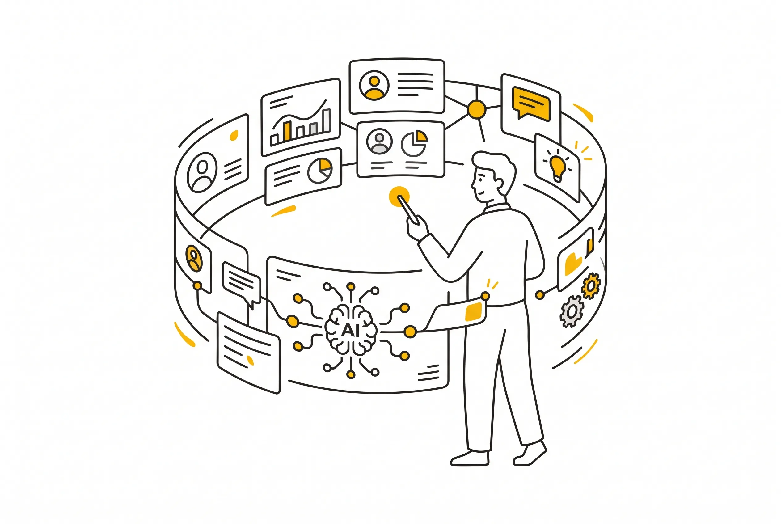
Table of Contents
Audio
Immersion is the feeling of being so absorbed in a product that you stop noticing you're using an interface at all. It's not the same as good design, and it isn't automatically a goal worth chasing either, though most product teams treat it that way.
The word gets thrown around constantly right now, usually stapled to another buzzword: AI. Every roadmap review seems to promise an "immersive AI experience," as if immersion were a feature you could ship in Q3. It isn't. It's an outcome, a fragile one, that depends on how well an interface reads a person's context and then gets out of their way.
That gets more interesting the moment artificial intelligence enters the interface, because AI-driven products can adapt in real time instead of showing everyone the same screen. That capability, often labeled an intelligent user interface, changes what immersion looks like in a product context. Not a VR headset, but a support chat that already has your order number pulled up, or a dashboard that quietly reorders itself around what you actually touch each week.
Immersion Definition: What Product Teams Get Wrong
Ask a couple of people on a product team to define immersion and you'll get five different answers, which is exactly the problem a 2023 study set out to fix. Researchers Han, Melissen, and Haggis-Burridge ran a multidisciplinary Delphi study and landed on five recurring components: how a user transitions into and out of an experience, how much control they retain once inside it, how the environment is designed, how well it fits the user's context, and how open that user already is to being drawn in. Notice that "flashy" isn't one of the five.
That last point matters more in a B2B SaaS dashboard than in a game. I once watched a support team argue for three sprints about whether a new ticket queue needed a slide-in animation to feel "more immersive." It didn't need an animation. It needed the agent's most urgent ticket to load first, without clicking through four filters to find it. That's immersion by the Delphi definition: a smooth transition into the task and enough control once you're there, no motion graphics required.
Engagement and immersion get treated as synonyms, and they aren't. Engagement is about return visits and time on task, the metrics that show up in a growth deck. Immersion is about attention while the person is already there. A product can be engaging in a shallow way, sending push notifications that pull people back constantly, without ever being immersive, because every visit still feels like fighting the interface. The reverse also happens: a niche internal tool used by twelve people can be deeply immersive for those twelve, with zero engagement metrics to show for it because nobody outside that team ever opens it.
For product managers, the practical takeaway is to stop asking "how do we make this more immersive" as a design brief. Ask instead which specific friction point breaks a user's flow, then fix that one thing. Immersion tends to follow.
How Intelligent User Interfaces Build Immersion
An intelligent user interface, usually shortened to IUI, is any interface with an AI model reading context and adapting what it shows because of that context. A 2022 systematic review in the journal Sensors looked at 211 studies of intelligent user interfaces and found that adaptation was the trait researchers agreed on most, showing up in over half of all definitions surveyed. Representation and personalization came next. Fixed automation that follows the same rule for every user, no matter what, didn't count.
That distinction is the whole game for product teams building on top of AI. A chatbot that answers every question the same way, regardless of who's asking or what they asked five minutes ago, is automation. A chatbot that remembers you already tried the standard troubleshooting steps and skips straight to the escalation path is an IUI, and that's the difference between a support flow that feels immersive and one that feels like filling out the same form twice.
This is where solid UI and UX design fundamentals still do most of the heavy lifting, even in an AI-powered product. An adaptive backend is wasted on a front end that buries the adapted content under three extra clicks. I've reviewed AI feature specs where the model correctly predicted what a user needed next, and the design team then stuck that prediction in a sidebar nobody scrolls to. The intelligence was real. The immersion wasn't, because the interface never acted on what it knew.
The review also flagged something product teams should sit with: most of those 211 studies never rigorously measured whether their "smart" interface actually improved the user experience. Researchers assumed adaptation equaled better, tested usability separately if at all, and moved on. Before greenlighting an IUI feature because it sounds sophisticated, ask what specific moment of friction it removes, and how you'll know if it worked.
Designing an AI User Interface Without Overreach
Nielsen Norman Group's research on generative UI describes a real shift already underway: AI generating a version of an interface on the fly for each person, rather than designers building one static screen for everyone. That's a bigger jump than most roadmaps admit. It means the "design" a user sees might not exist anywhere until the moment they load the page.
That power comes with an obvious trap. The more an AI user interface tailors itself to hold someone's attention, the closer it drifts toward manipulation, and product managers are usually the ones who have to draw that line, not legal or design alone. A few checkpoints that hold up in practice:
- If the interface adapts based on behavior a user never explicitly agreed to share, say so somewhere they'll actually see it, not buried three levels deep in a settings page.
- Immersion built on withholding information, like hiding a cancel button until someone hunts for it, isn't immersion. It's friction with better lighting.
- Test the adaptive version against a plain, non-personalized version with real users, not just A/B click-through data. Ask them directly whether the interface felt like it understood them or felt like it was watching them.
Grounding these decisions in core UX strategy rather than novelty keeps AI features from becoming a solution looking for a problem. I've sat in enough roadmap reviews to know the fastest way to lose a team's trust in an AI feature is one creepy personalization moment, like an app referencing a search someone never meant to be tracked. That single moment undoes months of good adaptive design. Building an interface people trust enough to get lost in still starts with the basics: clarity, consent, and control, before any of it gets labeled AI.
FAQs
Conclusion
Immersion isn't a feature to bolt onto a roadmap, and it definitely isn't a synonym for "add AI." It's what happens when an interface, intelligent or not, removes enough friction that a person forgets they're operating software at all.
Start smaller than a full AI overhaul. Pick one flow where users currently drop out of focus, whether that's a form, a dashboard, or a support queue, and ask what specific piece of context would let it adapt to the person using it. That's a more useful brief than "make it more immersive," and it's one your team can actually ship.

Interested in working with us?
Our Interim/Fractional Product Managers, Owners, and Leaders quickly fill gaps, scale your team, or lead key initiatives during transitions. We onboard swiftly, align teams, and deliver results.
Read More Posts
October 5, 2026
Value Proposition: What It Is and How to Write One That Sells
A value proposition tells a specific customer why your product beats their current option. Learn the meaning, canvas examples, and how to test yours.
July 17, 2026
Product Stickiness: Definition, Metrics, and How to Improve It
Product stickiness measures how often users return to your product. Learn the DAU/MAU formula, real benchmarks, and how to improve it.
October 1, 2026
How to Map and Manage Stakeholders with Mendelow's Matrix
Mendelow's matrix sorts stakeholders by power and interest. Learn the four quadrants, see a worked product example, and avoid the common mapping mistakes.